
Layouts
A layout decides where topics sit on the canvas. It never changes what is in the map, so you can switch as often as you like. Open ⋮ → Layout and tap one. The map re-arranges itself and the view zooms to fit.
Horizontal is free. The other seven need Pro.
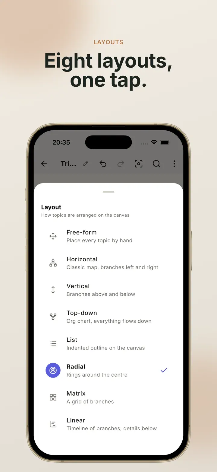
The eight layouts
Section titled “The eight layouts”| Layout | What it looks like | Good for |
|---|---|---|
| Horizontal | Branches to the left and right of the central topic, balanced by size | Classic mind maps and brainstorming |
| Vertical Pro | Branches above and below | Tall screens, and maps with long topic names |
| Top-down Pro | An org chart, where everything flows downward | Teams, hierarchies and breakdowns of work |
| List Pro | An indented outline, drawn on the canvas | Reading a map top to bottom |
| Radial Pro | Rings around the centre, one ring per level | Exploring a topic in every direction |
| Matrix Pro | A grid of branches, each one a small list | Comparing several areas side by side |
| Linear Pro | A timeline of branches, with the details under each | Plans, phases and schedules |
| Free-form Pro | Every topic stays exactly where you put it | Maps where position means something |
Free-form
Section titled “Free-form”In every other layout the app places topics for you, and a topic you drag onto empty space springs back. In free-form, it stays where you drop it.
Switching to free-form keeps the map exactly where it was, so nothing jumps. You start from the tidy arrangement you already had and adjust from there. New topics still arrive in a sensible spot below their siblings rather than piled on top of each other.
Compact spacing
Section titled “Compact spacing”At the bottom of the layout sheet, Compact spacing shortens the connectors so more of the map fits on screen. It works with all eight layouts. Topics stay the same size. To change text size, go to Settings → Topic text size instead.
Compact spacing is saved with the map, so one map can be compact while the others are not. Image and PDF exports use the same spacing you see on screen.
Related
Section titled “Related”- Change layout and style: step by step
- Style and themes: colours, shapes and fonts
- Free and Pro: everything Pro adds
 Mind Map: Smart Mind
Made by MyGems · © 2026 MyGems